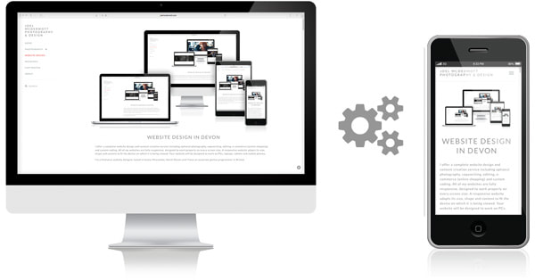
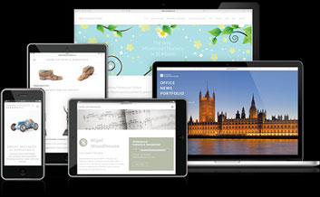
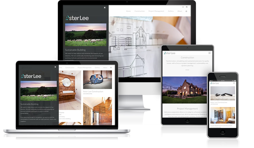
A responsive website adapts its size, shape and content to fit the device on which it is being viewed. All of my websites are designed to work properly on desktops, laptops, tablets and mobile phones. If your current website looks great on your PC, but terrible on your phone, I can redesign it to display beautifully at all screen sizes.
JOEL McDERMOTT
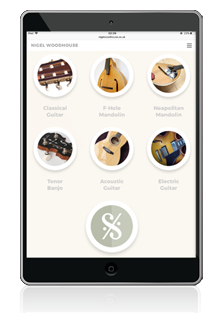
WEBSITE DESIGN FOR MOBILE PHONES
If your website doesn't work properly on mobile phones your visitors will be frustrated and are likely to turn away. Google won't like it either – it will analyse your site and make a decision about how well it works on mobile. If it decides that your site is not mobile-friendly, Google will punish you! Your site will appear lower down in the search results so potential visitors may miss your site altogether.
How to make a website work on mobile phones? This isn't done by simply pressing a magic button*, and it isn't done in a hurry. I consider each element of the website and how it fits into the mobile website layout. I adjust the position, size and behaviour of pictures, text and other elements to make sure that everything fits together.
Responsive website design is suited to longer scrolling pages which are easier to use on mobile and tablet screens. Longer pages can comfortably accommodate more content, so text length is not an absolute priority. Text quality is far more important – for Search Engine Optimisation (SEO) and reader satisfaction/interest.
*actually there is a kind of magic button, but it often results in elements of the website being forced together in a bit of a mess.
JOEL McDERMOTT
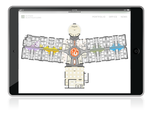
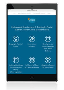
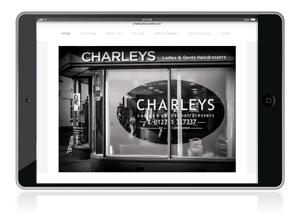
WEBSITE DESIGN FOR TABLETS
Tablet screens are sometimes neglected by website designers and it is often tempting to treat them as larger versions of mobile phones when considering design and layout. This is fine for some websites, especially for tablets in portrait (upright) mode, but it is usually necessary to approach the designs for tablet screens in both portrait and landscape modes separately.